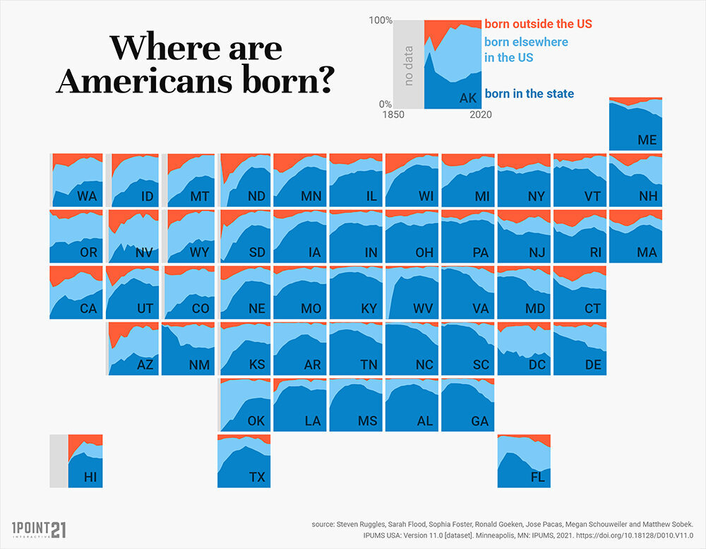
“Rather pleased with this map,” said Erin when she tweeted it on February 2, 2022. This is quite the understatement: Her map went viral almost immediately. Why? Because the map is an infographic that does a stellar job of answering its own question: Where are Americans born? The graph packs a lot of info, yet it is easy to decipher and can be read in a variety of ways. Its colorful combination of structure and variation is also pleasing to the eye. Each state is represented by a square of…


