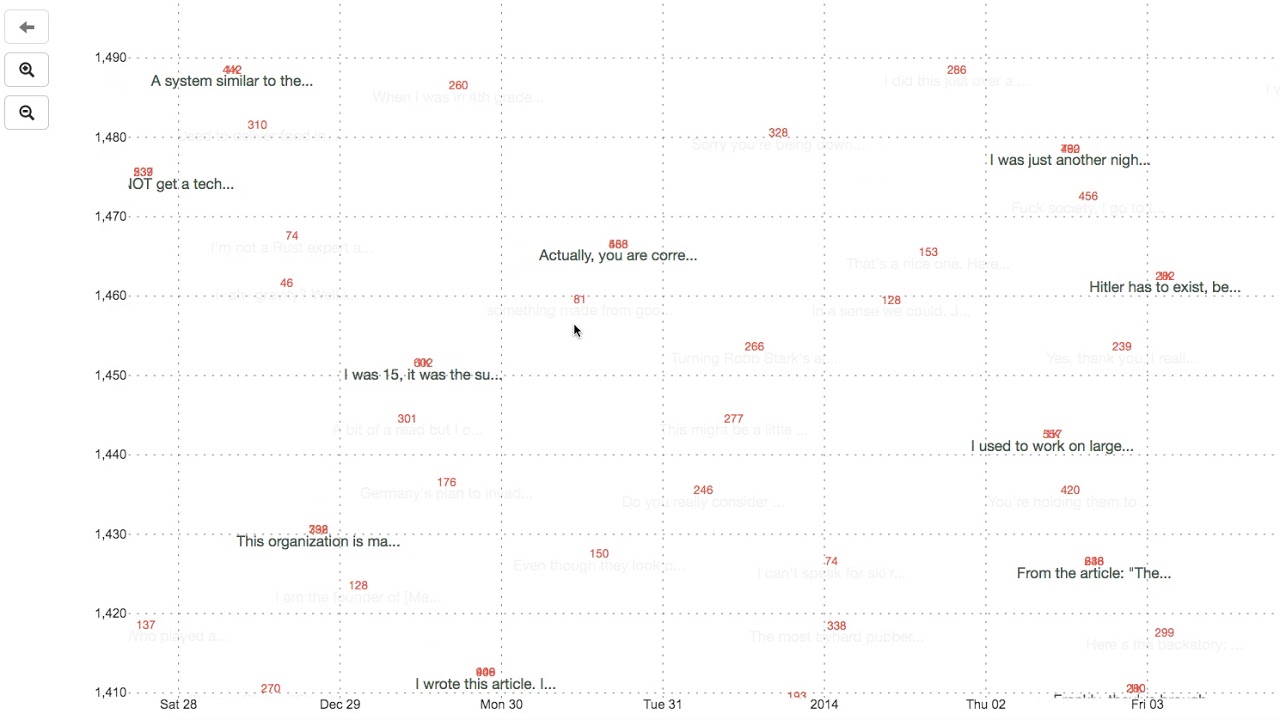
Scatterplots. You might not know them by name, but if you spend more than 10 minutes online you’ll find them everywhere. They’re popular in news articles, in the data science community, and, perhaps most crucially, for internet memes about the digestive quality of pancakes. By depicting data as a mass of points across two axes, scatterplots are effective in visualizing trends, correlations, and anomalies. But using them for large datasets often leads to overlapping dots that make them more or less unreadable. Researchers from MIT’s Computer Science and Artificial Intelligence…


